


A Tutorial on People Analytics Using R – Employee Churn

This is the last article in a series of three articles on employee churn published on AIHR Analytics. In this article I will demonstrate how to build, evaluate and deploy your predictive turnover model, using R.
To start I will first briefly introduce my vision on employee churn and summarize the data science process.
You may be asking what is Employee Churn? In one word, turnover, its when employees leave the organization. In another word, terminates, whether it be voluntary or involuntary. In the widest sense churn or turnover is concerned with both the calculation of rates of people leaving the organization and the individual terminates themselves.
Most of the focus in the past has been on the ‘rates’, not on the individual terminates. We calculate past rates or turnover in an attempt to predict future turnover rates. And indeed it is important to do that and to continue to do so. Data warehousing tools are very powerful in this regard to slice and dice this data efficiently over different time periods at different levels of granularity. BUT it is only half the picture.
These turnover rates only show the impact of churn or turnover in the ‘aggregate’. In addition to this, you might be interested in predicting exactly ‘who’ or ‘which employees’ exactly may be at high risk of leaving the organization. This is why we are interested in the individual in addition to the aggregate.
Statistically speaking, ‘churn’ is ‘churn’ regardless of context. It’s when a member of a population leaves a population. One of the examples you will see in Microsoft AzureML and in many data science textbooks out there is ‘customer’ churn. This is from the marketing context.
In many businesses such a cell phone companies and others, it is far harder to generate and attract new customers than it is to keep old ones. So businesses want to do what they can to keep existing customers. When they leave, that is ‘customer churn’ for that particular company.
This kind of thinking and mindset applies to Human Resources as well. It is far less expensive to ‘keep’ good employees once you have them, then the cost of attracting and training new ones. So we have a marketing principle that applies to the management of human resources, and a data science set of algorithms that can help determine whether there are patterns of churn in our data that could help predict future churn.
This analysis is an example of how HR needs to start thinking outside of its traditional box. This analysis helps to address future HR challenges and issues.
On a personal level, I like to think of People Analytics as when the data science process is applied to HR information. For that reason, I would like to revisit what that process is and use it as the framework to guide the rest of the example illustrated in this article.

The Data Science Process Revisited
The data science process consists of six steps.
- Define a goal. As mentioned above, this means identifying what HR management
business problem you are trying to solve. Without a problem or issue to solve, we don’t have a
goal. - Collect and Manage data. At its simplest, you want a ‘dataset’ of information perceived to be relevant to the problem. The collection and management of data could be a simple extract from the corporate Human Resource Information System, or an output from an elaborate Data Warehousing, or Business Intelligence tool used on HR information. For the purpose of this article, we will use a simple Character Separate Value (CSV) file. It also involves exploring the data both for data quality issues and for an initial look at what the data may be telling you
- Build The Model. After you have defined the HR business problem or goal you are trying to achieve, you pick a data mining approach or tool that is designed to address that type of problem. With Employee Churn you are trying to predict who might leave as contrasted from those that stay. The business problem determines the appropriate data mining tools to consider. Common data mining approaches used in modeling are classification, regression, anomaly detection, time series, clustering, and association analyses to name a few. These approaches take information/data as inputs, run them through statistical algorithms, and produce output.
- Evaluate and Critique Model. Each data mining approach can have many different statistical algorithms to bring to bear on the data. The evaluation is both what algorithms provide the most consistently accurate predictions on new data, and do we have all the relevant data – or do we need more types of data to increase the predictive accuracy of the model? This process can be a repetitive and circular activity over time to improve the model
- Present Results and Document. When we have gotten our model to an acceptable, useful predictive level, we document our activity and present results. The definition of acceptable and useful is really relative to the organization, but in all cases would mean results show improvement over what would have been otherwise. The principle behind data ‘science’ like any science, is that with the same data and method, people should be able to reproduce our findings.
- Deploy Model. The whole purpose of building the model (which is on existing data) is to:
- use the model on future data when it becomes available to predict or prevent something from happening before it occurs or
- to better understand our existing business problem to tailor more specific responses
Step 1. Define The Goal
Our hypothetical company wants to apply data science principles and steps to deal with a critical HR issue: employee churn. It realizes that when good people leave, it costs far more to replace them than providing them with some incentives to keep them. So it would like to be data-driven in the HR decisions it makes with respect to employee retention.
The following questions are among the ones they would like answered:
- What proportion of our staff is leaving?
- Where is it occurring?
- How does Age and Length of Service affect termination?
- What, if anything, else contributes to it?
- Can we predict future terminations?
- If so, how well can we predict?
Step 2 – Collect and Manage the Data
Often the data to analyze the problem starts with what is currently readily available. After some initial prototyping of predictive models, ideas surface for additional data collection to further refine the model. Since this is first stab at this, the organization uses only what is readily available.
After consulting with their HRIS staff, they found that they have access to the following information:
- EmployeeID
- Record Date
- Birth Date
- Original Hire Date
- Termination Date (if terminated)
- Age
- Length of Service
- City
- Department
- Job title
- Store Name
- Gender
- termination reason
- termination type (voluntary or involuntary)
- Status Year – year of data
- Status – ACTIVE or TERMINATED during Status year
- Business Unit – either Stores or Head Office
The company found out that they have 10 years of good data – from 2006 to 2015. It wants to use 2006-2014 as training data and use 2015 as the data to test on. The data consists of
- a snapshot of all active employees at the end of each of those years combined with
- terminations that occurred during each of those years.
Therefore, each year will have records that have either a status of ‘active’ or ‘terminated’. Of the above information items listed, the ‘STATUS’ one is the ‘dependent’ variable. This is the category to be predicted. The others are independent variables. They are the potential predictors.
First Look at The Data – The Structure
Let’s load in the data. (By the way, the data below is totally contrived)
You can find the datasets for this company here. Feel free to use these datasets for the tutorial.
# Load an R data frame.
MFG10YearTerminationData <- read.csv("~/Visual Studio 2015/Projects/EmployeeChurn/EmployeeChurn/MFG10YearTerminationData.csv")
MYdataset <- MFG10YearTerminationData
str(MYdataset)

## 'data.frame':   49653 obs. of 18 variables:
## $ EmployeeID         : int 1318 1318 1318 1318 1318 1318 1318 1318 1318 1318 ...
## $ recorddate_key     : Factor w/ 130 levels "1/1/2006 0:00",..: 41 42 43 44 45 46 47 48 49 50 ...
## $ birthdate_key     : Factor w/ 5342 levels "1941-01-15","1941-02-14",..: 1075 1075 1075 1075 1075 1075 1075 1075 1075 1075 ...
## $ orighiredate_key   : Factor w/ 4415 levels "1989-08-28","1989-08-31",..: 1 1 1 1 1 1 1 1 1 1 ...
## $ terminationdate_key: Factor w/ 1055 levels "1900-01-01","2006-01-01",..: 1 1 1 1 1 1 1 1 1 1 ...
## $ age               : int 52 53 54 55 56 57 58 59 60 61 ...
## $ length_of_service : int 17 18 19 20 21 22 23 24 25 26 ...
## $ city_name         : Factor w/ 40 levels "Abbotsford","Aldergrove",..: 35 35 35 35 35 35 35 35 35 35 ...
## $ department_name   : Factor w/ 21 levels "Accounting","Accounts Payable",..: 10 10 10 10 10 10 10 10 10 10 ...
## $ job_title         : Factor w/ 47 levels "Accounting Clerk",..: 9 9 9 9 9 9 9 9 9 9 ...
## $ store_name         : int 35 35 35 35 35 35 35 35 35 35 ...
## $ gender_short       : Factor w/ 2 levels "F","M": 2 2 2 2 2 2 2 2 2 2 ...
## $ gender_full       : Factor w/ 2 levels "Female","Male": 2 2 2 2 2 2 2 2 2 2 ...
## $ termreason_desc   : Factor w/ 4 levels "Layoff","Not Applicable",..: 2 2 2 2 2 2 2 2 2 2 ...
## $ termtype_desc     : Factor w/ 3 levels "Involuntary",..: 2 2 2 2 2 2 2 2 2 2 ...
## $ STATUS_YEAR       : int 2006 2007 2008 2009 2010 2011 2012 2013 2014 2015 ...
## $ STATUS             : Factor w/ 2 levels "ACTIVE","TERMINATED": 1 1 1 1 1 1 1 1 1 1 ...
## $ BUSINESS_UNIT     : Factor w/ 2 levels "HEADOFFICE","STORES": 1 1 1 1 1 1 1 1 1 1 ...

library(plyr)
library(dplyr)

##
## Attaching package: 'dplyr'
##
## The following objects are masked from 'package:plyr':
##
##     arrange, count, desc, failwith, id, mutate, rename, summarise,
##     summarize
##
## The following objects are masked from 'package:stats':
##
##     filter, lag
##
## The following objects are masked from 'package:base':
##
##     intersect, setdiff, setequal, union
Second Look at The Data – Data Quality
We will now assess data quality, using a few simple descriptive statistics, including the minimum value, mean, and max, and creating a number of counts.
summary(MYdataset)

##    EmployeeID           recorddate_key     birthdate_key
##  Min.   :1318   12/31/2013 0:00: 5215   1954-08-04:   40
##  1st Qu.:3360   12/31/2012 0:00: 5101   1956-04-27:   40
##  Median :5031   12/31/2011 0:00: 4972   1973-03-23:   40
##  Mean   :4859   12/31/2014 0:00: 4962   1952-01-27:   30
##  3rd Qu.:6335   12/31/2010 0:00: 4840   1952-08-10:   30
##  Max.   :8336   12/31/2015 0:00: 4799   1953-10-06:   30
##                 (Other)        :19764   (Other)   :49443
##    orighiredate_key terminationdate_key      age        length_of_service
##  1992-08-09:   50   1900-01-01:42450    Min.   :19.00   Min.   : 0.00
##  1995-02-22:   50   2014-12-30: 1079    1st Qu.:31.00   1st Qu.: 5.00
##  2004-12-04:   50   2015-12-30:  674    Median :42.00   Median :10.00
##  2005-10-16:   50   2010-12-30:   25    Mean   :42.08   Mean   :10.43
##  2006-02-26:   50   2012-11-11:   21    3rd Qu.:53.00   3rd Qu.:15.00
##  2006-09-25:   50   2015-02-04:   20    Max.   :65.00   Max.   :26.00
##  (Other)   :49353   (Other)   : 5384
##            city_name             department_name          job_title
##  Vancouver      :11211   Meats           :10269   Meat Cutter  :9984
##  Victoria       : 4885   Dairy           : 8599   Dairy Person :8590
##  Nanaimo        : 3876   Produce         : 8515   Produce Clerk:8237
##  New Westminster: 3211   Bakery          : 8381   Baker        :8096
##  Kelowna        : 2513   Customer Service: 7122   Cashier      :6816
##  Burnaby        : 2067   Processed Foods : 5911   Shelf Stocker:5622
##  (Other)        :21890   (Other)         :  856   (Other)      :2308
##    store_name   gender_short gender_full          termreason_desc
##  Min.   : 1.0   F:25898      Female:25898   Layoff        : 1705
##  1st Qu.:16.0   M:23755      Male  :23755   Not Applicable:41853
##  Median :28.0                               Resignaton    : 2111
##  Mean   :27.3                               Retirement    : 3984
##  3rd Qu.:42.0
##  Max.   :46.0
##
##         termtype_desc    STATUS_YEAR          STATUS
##  Involuntary   : 1705   Min.   :2006   ACTIVE    :48168
##  Not Applicable:41853   1st Qu.:2008   TERMINATED: 1485
##  Voluntary     : 6095   Median :2011
##                         Mean   :2011
##                         3rd Qu.:2013
##                         Max.   :2015
##
##     BUSINESS_UNIT
##  HEADOFFICE:  585
##  STORES    :49068
##
##
##
##
##
A cursory look at the above summary doesn’t have anything jump out as being data quality issues.
Related: An overview of human resources metrics
Third Look at the Data – Generally What Is The Data Telling Us?
Earlier we had indicated that we had both active records at end of year and terminates during the year for each of 10 years going from 2006 to 2015. To have a population to model from (to differentiate ACTIVES from TERMINATES) we have to include both status types.
It’s useful then to get a baseline of what percent/proportion the terminates are of the entire population. It also answers our first question. Let’s look at that next.
What proportion of our staff is leaving?
StatusCount<- as.data.frame.matrix(MYdataset %>%
group_by(STATUS_YEAR) %>%
select(STATUS) %>%
table())
StatusCount$TOTAL<-StatusCount$ACTIVE + StatusCount$TERMINATED
StatusCount$PercentTerminated <-StatusCount$TERMINATED/(StatusCount$TOTAL)*100
StatusCount

##      ACTIVE TERMINATED TOTAL PercentTerminated
## 2006   4445        134  4579          2.926403
## 2007   4521        162  4683          3.459321
## 2008   4603        164  4767          3.440319
## 2009   4710        142  4852          2.926628
## 2010   4840        123  4963          2.478340
## 2011   4972        110  5082          2.164502
## 2012   5101        130  5231          2.485184
## 2013   5215        105  5320          1.973684
## 2014   4962        253  5215          4.851390
## 2015   4799        162  4961          3.265471

mean(StatusCount$PercentTerminated)

## [1] 2.997124
It looks like it ranges from 1.97 to 4.85% with an average of 2.99%
Where are the terminations occurring?
Lets look at some charts
By Business Unit
library(ggplot2)
ggplot() + geom_bar(aes(y = ..count..,x =as.factor(BUSINESS_UNIT),fill = as.factor(STATUS)),data=MYdataset,position = position_stack())
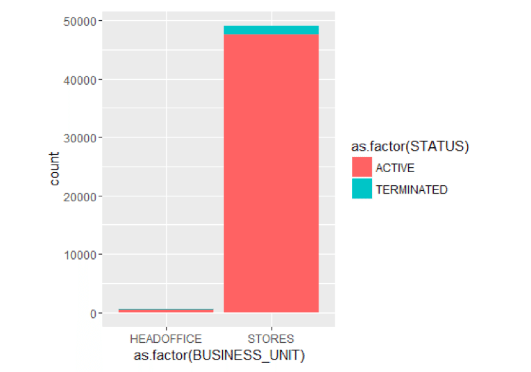
It looks like terminates is the last 10 years have predominantly occurred in the STORES business unit. Only 1 terminate in HR Technology which is in the head office.
Let’s explore just the terminates for a few moments.
Just Terminates By Termination Type And Status Year
TerminatesData<- as.data.frame(MYdataset %>%
filter(STATUS=="TERMINATED"))
ggplot() + geom_bar(aes(y = ..count..,x =as.factor(STATUS_YEAR),fill = as.factor(termtype_desc)),data=TerminatesData,position = position_stack())
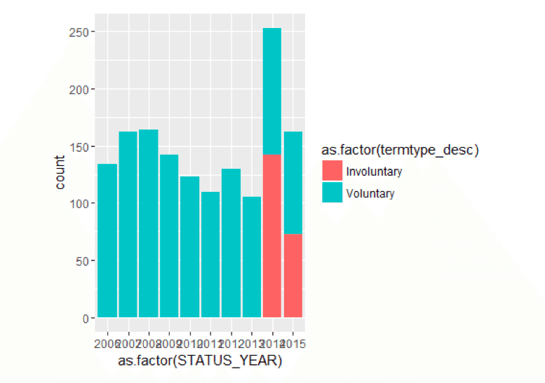
Generally, most terminations seem to be voluntary year by year, except in the most recent years where is are some involuntary terminates. By the way, these kinds of insights are often included in a workforce dashboard.
Just Terminates By Status Year and Termination Reason
ggplot() + geom_bar(aes(y = ..count..,x =as.factor(STATUS_YEAR),fill = as.factor(termreason_desc)),data=TerminatesData,position = position_stack())
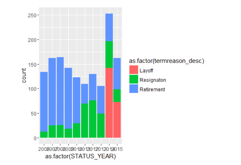
It seems that there were layoffs in 2014 and 2015 which accounts for the involuntary terminates.
Just Terminates By Termination Reason and Department
ggplot() + geom_bar(aes(y = ..count..,x =as.factor(department_name),fill = as.factor(termreason_desc)),data=TerminatesData,position = position_stack())+
 theme(axis.text.x=element_text(angle=90,hjust=1,vjust=0.5))
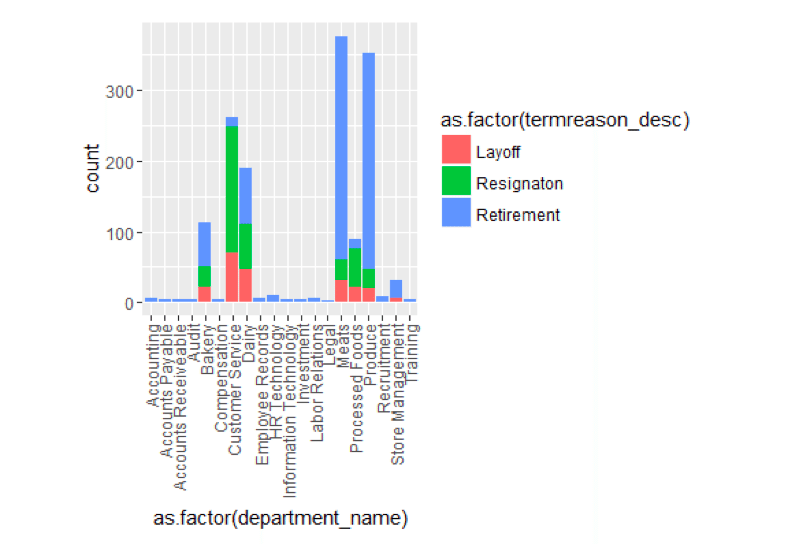
When we look at the terminate by Department, a few things stick out. Customer Service has a much larger proportion of resignation compared to other departments. And retirement, in general, is high in a number of departments.
How does Age and Length of Service affect termination?
library(caret)
## Loading required package: lattice
featurePlot(x=MYdataset[,6:7],y=MYdataset$STATUS,plot="density",auto.key = list(columns = 2))
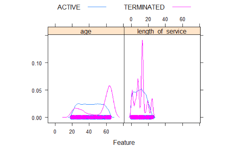
Density plots show some interesting things. For terminates, there is some elevation from 20 to 30 and a spike at 60. For length of service there are 5 spikes. One around 1 year, another one around 5 years, and a big one around 15 years, and a couple at 20 and 25 years.
Age and Length of Service Distributions By Status
featurePlot(x=MYdataset[,6:7],y=MYdataset$STATUS,plot="box",auto.key = list(columns = 2))
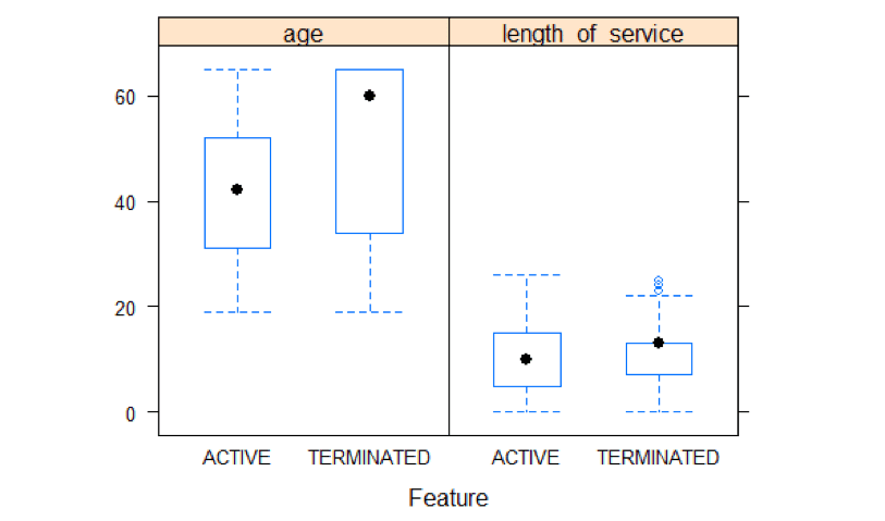
A boxplot analysis shows a high average age for terminates as compared to active. Length of service shows not much difference between active and terminated.
That’s a brief general look at some of what the data is telling us. Our next step is model building.
Related: An overview of key employee performance metrics
Step 3 – Build The Model
It should be mentioned again that for building models, we never want to use all our data to build the model. This can lead to overfitting, where it might be able to predict well on current data that it sees as is built on, but may not predict well on data that it hasn’t seen.
We have 10 years of historical data. This is a lot, usually, companies work only with a few years. In our case, we will use the first 9 to train the model, and the 10th year to test it. Moreover, we will use 10 fold cross-validation on the training data as well. So before we actually try out a variety of modeling algorithms, we need to partition the data into training and testing datasets.
Let’s Partition The Data
library(rattle)
## Rattle: A free graphical interface for data mining with R.
## Version 4.0.5 Copyright (c) 2006-2015 Togaware Pty Ltd.
## Type 'rattle()' to shake, rattle, and roll your data.
library(magrittr) # For the %>% and %<>% operators.


building TRUE
scoring  # A pre-defined value is used to reset the random seed so that results are repeatable.

crv$seed 42


# Load an R data frame.
MFG10YearTerminationData read.csv("~/Visual Studio 2015/Projects/EmployeeChurn/EmployeeChurn/MFG10YearTerminationData.csv")

MYdataset #Create training and testing datasets

#Create training and testing datasets

set.seed(crv$seed)
MYnobs nrow(MYdataset) # 52692 observations
MYsample subset(MYdataset,STATUS_YEAR<=2014)
MYvalidate NULL
MYtest subset(MYdataset,STATUS_YEAR== 2015)

# The following variable selections have been noted.

MYinput c("age", "length_of_service",    "gender_full", "STATUS_YEAR", "BUSINESS_UNIT")

MYnumeric c("age", "length_of_service", "STATUS_YEAR")

MYcategoric c("gender_full", "BUSINESS_UNIT")

MYtarget  "STATUS"
MYrisk    NULL
MYident   "EmployeeID"
MYignore  c("recorddate_key", "birthdate_key", "orighiredate_key", "terminationdate_key", "city_name", "gender_short", "termreason_desc", "termtype_desc","department_name","job_title", "store_name")
MYweights NULL

MYTrainingData<-MYtrain[c(MYinput, MYtarget)]
MYTestingData<-MYtest[c(MYinput, MYtarget)]
Choosing and Running Models
One of the things that characterizes R, is that the number of functions and procedures that can be used are huge. So there often many ways of doing things. Two of the best R packages designed to be used for data science are caret and rattle.
We introduced caret in the last blog article. In this one, I will use Rattle. What is noteworthy about rattle is that it provides a GUI front end and generates the code for it in the log on the backend. So you can generate models quickly.
I won’t be illustrating how to use rattle in this article as a GUI, but rather show the code it generated along with the statistical results and graphs. Please don’t get hung up/turned off by the code presented. The GUI front-end generated all the code below. I simply made cosmetic changes to it. Please do concentrate on the flow of the data science process in the article as one example of how it can be done. As a GUI, rattle was able to generate all the below output in about 15 minutes of my effort. One tutorial on the Rattle GUI can be found here. And here is a book on Rattle.
We should step back for a moment and review what are doing here, and what are opening questions were. We are wanting to predict who might terminate in the future. That is a ‘binary result’ or ‘category’. A person is either ‘ACTIVE’ or ‘TERMINATED’. Since it is a category to be predicted, we will choose among models/algorithms that can predict categories.
The models we will look at in rattle are:
- Decision Trees (rpart)
- Boosted Models (adaboost)
- Random Forests (rf)
- Support Vactor Models (svm)
- Linear Models (glm)
Decision Tree
Lets first u take a look at a decision tree model. This is always useful because with these, you can get a visual tree model to get some idea of how the prediction occurs in an easy to understand way.
library(rattle)
library(rpart, quietly=TRUE)

# Reset the random number seed to obtain the same results each time.

set.seed(crv$seed)

# Build the Decision Tree model.

MYrpart rpart(STATUS ~ .,
                   data=MYtrain[, c(MYinput, MYtarget)],
                   method="class",
                   parms=list(split="information"),
                   control=rpart.control(usesurrogate=0,
                                         maxsurrogate=0))

# Generate a textual view of the Decision Tree model.

#print(MYrpart)
#printcp(MYrpart)
#cat("\n")

# Time taken: 0.63 secs

#============================================================
# Rattle timestamp: 2016-03-25 09:45:25 x86_64-w64-mingw32

# Plot the resulting Decision Tree.

# We use the rpart.plot package.

fancyRpartPlot(MYrpart, main="Decision Tree MFG10YearTerminationData $ STATUS")
We can now answer our question from above:
What, if anything, else contributes to it?
From even the graphical tree output it looks like gender, and status year affect it.
Random Forests
Now for Random Forests
#============================================================
# Rattle timestamp: 2016-03-25 18:21:29 x86_64-w64-mingw32

# Random Forest

# The 'randomForest' package provides the 'randomForest' function.

library(randomForest, quietly=TRUE)
## randomForest 4.6-12
## Type rfNews() to see new features/changes/bug fixes.
##
## Attaching package: 'randomForest'
##
## The following object is masked from 'package:ggplot2':
##
##     margin
##
## The following object is masked from 'package:dplyr':
##
##     combine
# Build the Random Forest model.

set.seed(crv$seed)
MYrf randomForest(STATUS ~ .,
                                   data=MYtrain[c(MYinput, MYtarget)],
                                   ntree=500,
                                   mtry=2,
                                   importance=TRUE,
                                   na.action=randomForest::na.roughfix,
                                   replace=FALSE)

# Generate textual output of 'Random Forest' model.

MYrf
##
## Call:
##  randomForest(formula = STATUS ~ ., data = MYtrain[c(MYinput,      MYtarget)], ntree = 500, mtry = 2, importance = TRUE, replace = FALSE,      na.action = randomForest::na.roughfix)
##                Type of random forest: classification
##                      Number of trees: 500
## No. of variables tried at each split: 2
##
##         OOB estimate of  error rate: 1.13%
## Confusion matrix:
##            ACTIVE TERMINATED  class.error
## ACTIVE      43366          3 6.917383e-05
## TERMINATED    501        822 3.786848e-01
# The `pROC' package implements various AUC functions.

# Calculate the Area Under the Curve (AUC).

pROC::roc(MYrf$y, as.numeric(MYrf$predicted))
##
## Call:
## roc.default(response = MYrf$y, predictor = as.numeric(MYrf$predicted))
##
## Data: as.numeric(MYrf$predicted) in 43369 controls (MYrf$y ACTIVE) < 1323 cases (MYrf$y TERMINATED).
## Area under the curve: 0.8106
# Calculate the AUC Confidence Interval.

pROC::ci.auc(MYrf$y, as.numeric(MYrf$predicted))
## 95% CI: 0.7975-0.8237 (DeLong)
# List the importance of the variables.

rn round(randomForest::importance(MYrf), 2)
rn[order(rn[,3], decreasing=TRUE),]
##                   ACTIVE TERMINATED MeanDecreaseAccuracy MeanDecreaseGini
## age                36.51     139.70                52.45           743.27
## STATUS_YEAR        35.46      34.13                41.50            64.65
## gender_full        28.02      40.03                37.08            76.80
## length_of_service  18.37      18.43                21.38            91.71
## BUSINESS_UNIT       6.06       7.64                 8.09             3.58
# Time taken: 18.66 secs
Adaboost
Now for Adaboost
#============================================================
# Rattle timestamp: 2016-03-25 18:22:22 x86_64-w64-mingw32

# Ada Boost

# The `ada' package implements the boost algorithm.

# Build the Ada Boost model.

set.seed(crv$seed)
MYada ada(STATUS ~ .,
                  data=MYtrain[c(MYinput, MYtarget)],
                  control=rpart::rpart.control(maxdepth=30,
                                               cp=0.010000,
                                               minsplit=20,
                                               xval=10),
                                               iter=50)

# Print the results of the modelling.

print(MYada)
## Call:
## ada(STATUS ~ ., data = MYtrain[c(MYinput, MYtarget)], control = rpart::rpart.control(maxdepth = 30,
##     cp = 0.01, minsplit = 20, xval = 10), iter = 50)
##
## Loss: exponential Method: discrete   Iteration: 50
##
## Final Confusion Matrix for Data:
##             Final Prediction
## True value   ACTIVE TERMINATED
##   ACTIVE      43366          3
##   TERMINATED    501        822
##
## Train Error: 0.011
##
## Out-Of-Bag Error:  0.011  iteration= 6
##
## Additional Estimates of number of iterations:
##
## train.err1 train.kap1
##          1          1
round(MYada$model$errs[MYada$iter,], 2)
## train.err train.kap
##      0.01      0.24
cat('Variables actually used in tree construction:\n')
## Variables actually used in tree construction:
print(sort(names(listAdaVarsUsed(MYada))))
## [1] "age"               "gender_full"       "length_of_service"
## [4] "STATUS_YEAR"
cat('\nFrequency of variables actually used:\n')
##
## Frequency of variables actually used:
print(listAdaVarsUsed(MYada))
##
##               age       STATUS_YEAR length_of_service       gender_full
##                43                41                34                29
Support Vector Machines
Now let’s look at Support Vector Machines
#============================================================
# Rattle timestamp: 2016-03-25 18:22:56 x86_64-w64-mingw32

# Support vector machine.

# The 'kernlab' package provides the 'ksvm' function.

library(kernlab, quietly=TRUE)
##
## Attaching package: 'kernlab'
##
## The following object is masked from 'package:ggplot2':
##
##     alpha
# Build a Support Vector Machine model.

set.seed(crv$seed)
MYksvm ksvm(as.factor(STATUS) ~ .,
               data=MYtrain[c(MYinput, MYtarget)],
               kernel="rbfdot",
               prob.model=TRUE)

# Generate a textual view of the SVM model.

MYksvm
## Support Vector Machine object of class "ksvm"
##
## SV type: C-svc  (classification)
##  parameter : cost C = 1
##
## Gaussian Radial Basis kernel function.
##  Hyperparameter : sigma =  0.365136817631195
##
## Number of Support Vectors : 2407
##
## Objective Function Value : -2004.306
## Training error : 0.017811
## Probability model included.
# Time taken: 42.91 secs
Linear Models
Finally, let’s look at linear models.
#============================================================
# Rattle timestamp: 2016-03-25 18:23:56 x86_64-w64-mingw32

# Regression model

# Build a Regression model.

MYglm glm(STATUS ~ .,
             data=MYtrain[c(MYinput, MYtarget)],
             family=binomial(link="logit"))

# Generate a textual view of the Linear model.

print(summary(MYglm))
##
## Call:
## glm(formula = STATUS ~ ., family = binomial(link = "logit"),
##     data = MYtrain[c(MYinput, MYtarget)])
##
## Deviance Residuals:
##     Min       1Q   Median       3Q      Max
## -1.3245  -0.2076  -0.1564  -0.1184   3.4080
##
## Coefficients:
##                       Estimate Std. Error z value Pr(>|z|)
## (Intercept)         -893.51883   33.96609 -26.306  < 2e-16 ***
## age                    0.21944    0.00438  50.095  < 2e-16 ***
## length_of_service     -0.43146    0.01086 -39.738  < 2e-16 ***
## gender_fullMale        0.51900    0.06766   7.671  1.7e-14 ***
## STATUS_YEAR            0.44122    0.01687  26.148  < 2e-16 ***
## BUSINESS_UNITSTORES   -2.73943    0.16616 -16.486  < 2e-16 ***
## ---
## Signif. codes:  0 '***' 0.001 '**' 0.01 '*' 0.05 '.' 0.1 ' ' 1
##
## (Dispersion parameter for binomial family taken to be 1)
##
##     Null deviance: 11920.1  on 44691  degrees of freedom
## Residual deviance:  9053.3  on 44686  degrees of freedom
## AIC: 9065.3
##
## Number of Fisher Scoring iterations: 7
cat(sprintf("Log likelihood: %.3f (%d df)\n",
            logLik(MYglm)[1],
            attr(logLik(MYglm), "df")))
## Log likelihood: -4526.633 (6 df)
cat(sprintf("Null/Residual deviance difference: %.3f (%d df)\n",
            MYglm$null.deviance-MYglm$deviance,
            MYglm$df.null-MYglm$df.residual))
## Null/Residual deviance difference: 2866.813 (5 df)
cat(sprintf("Chi-square p-value: %.8f\n",
            dchisq(MYglm$null.deviance-MYglm$deviance,
                   MYglm$df.null-MYglm$df.residual)))
## Chi-square p-value: 0.00000000
cat(sprintf("Pseudo R-Square (optimistic): %.8f\n",
            cor(MYglm$y, MYglm$fitted.values)))
## Pseudo R-Square (optimistic): 0.38428451
cat('\n==== ANOVA ====\n\n')
##
## ==== ANOVA ====
print(anova(MYglm, test="Chisq"))
## Analysis of Deviance Table
##
## Model: binomial, link: logit
##
## Response: STATUS
##
## Terms added sequentially (first to last)
##
##
##                   Df Deviance Resid. Df Resid. Dev  Pr(>Chi)
## NULL                              44691    11920.1
## age                1   861.75     44690    11058.3 < 2.2e-16 ***
## length_of_service  1  1094.72     44689     9963.6 < 2.2e-16 ***
## gender_full        1    14.38     44688     9949.2 0.0001494 ***
## STATUS_YEAR        1   716.39     44687     9232.8 < 2.2e-16 ***
## BUSINESS_UNIT      1   179.57     44686     9053.3 < 2.2e-16 ***
## ---
## Signif. codes:  0 '***' 0.001 '**' 0.01 '*' 0.05 '.' 0.1 ' ' 1
cat("\n")
# Time taken: 1.62 secs
These were simply the vanilla running of these models. In evaluating the models we have the means to compare their results on a common basis.
Evaluate Models
In the evaluating model step, we are able to answer our final 2 original questions stated at the beginning:
Can we predict?
In a word ‘yes’.
How Well can we predict?
In two words ‘fairly well’.
When it comes to evaluating models for predicting categories, we are defining accuracy as to how many times did the model predict the actual. So we are interested in a number of things.
The first of these are error matrices. In error matrices, you are cross-tabulating the actual results with predicted results. If the prediction was a ‘perfect’ 100%, every prediction would be the same as actual. This almost never happens. The higher the correct prediction rate and lower the error rate, the better.
Error Matrices
Decision Trees
#============================================================
# Rattle timestamp: 2016-03-25 18:50:22 x86_64-w64-mingw32

# Evaluate model performance.

# Generate an Error Matrix for the Decision Tree model.

# Obtain the response from the Decision Tree model.

MYpr predict(MYrpart, newdata=MYtest[c(MYinput, MYtarget)], type="class")

# Generate the confusion matrix showing counts.

table(MYtest[c(MYinput, MYtarget)]$STATUS, MYpr,
      dnn=c("Actual", "Predicted"))
##             Predicted
## Actual       ACTIVE TERMINATED
##   ACTIVE       4799          0
##   TERMINATED     99         63
# Generate the confusion matrix showing proportions.

pcme table(actual, cl)
  nc nrow(x)
  tbl cbind(x/length(actual),
               Error=sapply(1:nc,
                            function(r) round(sum(x[r,-r])/sum(x[r,]), 2)))
  names(attr(tbl, "dimnames")) c("Actual", "Predicted")
  return(tbl)
}
per pcme(MYtest[c(MYinput, MYtarget)]$STATUS, MYpr)
round(per, 2)
##             Predicted
## Actual       ACTIVE TERMINATED Error
##   ACTIVE       0.97       0.00  0.00
##   TERMINATED   0.02       0.01  0.61
# Calculate the overall error percentage.

cat(100*round(1-sum(diag(per), na.rm=TRUE), 2))
## 2
# Calculate the averaged class error percentage.

cat(100*round(mean(per[,"Error"], na.rm=TRUE), 2))
## 30
Adaboost
# Generate an Error Matrix for the Ada Boost model.

# Obtain the response from the Ada Boost model.

MYpr predict(MYada, newdata=MYtest[c(MYinput, MYtarget)])

# Generate the confusion matrix showing counts.

table(MYtest[c(MYinput, MYtarget)]$STATUS, MYpr,
      dnn=c("Actual", "Predicted"))
##             Predicted
## Actual       ACTIVE TERMINATED
##   ACTIVE       4799          0
##   TERMINATED     99         63
# Generate the confusion matrix showing proportions.

pcme table(actual, cl)
  nc nrow(x)
  tbl cbind(x/length(actual),
               Error=sapply(1:nc,
                            function(r) round(sum(x[r,-r])/sum(x[r,]), 2)))
  names(attr(tbl, "dimnames")) c("Actual", "Predicted")
  return(tbl)
}
per pcme(MYtest[c(MYinput, MYtarget)]$STATUS, MYpr)
round(per, 2)
##             Predicted
## Actual       ACTIVE TERMINATED Error
##   ACTIVE       0.97       0.00  0.00
##   TERMINATED   0.02       0.01  0.61
# Calculate the overall error percentage.

cat(100*round(1-sum(diag(per), na.rm=TRUE), 2))
## 2
# Calculate the averaged class error percentage.

cat(100*round(mean(per[,"Error"], na.rm=TRUE), 2))
## 30
Random Forest
# Generate an Error Matrix for the Random Forest model.

# Obtain the response from the Random Forest model.

MYpr predict(MYrf, newdata=na.omit(MYtest[c(MYinput, MYtarget)]))

# Generate the confusion matrix showing counts.

table(na.omit(MYtest[c(MYinput, MYtarget])]$STATUS, MYpr,
      dnn=c("Actual", "Predicted"))
##             Predicted
## Actual       ACTIVE TERMINATED
##   ACTIVE       4799          0
##   TERMINATED     99         63
# Generate the confusion matrix showing proportions.

pcme table(actual, cl)
  nc nrow(x)
  tbl cbind(x/length(actual),
               Error=sapply(1:nc,
                            function(r) round(sum(x[r,-r])/sum(x[r,]), 2)))
  names(attr(tbl, "dimnames")) c("Actual", "Predicted")
  return(tbl)
}
per pcme(MYtest[c(MYinput, MYtarget)]$STATUS, MYpr)
round(per, 2)
##             Predicted
## Actual       ACTIVE TERMINATED Error
##   ACTIVE       0.97       0.00  0.00
##   TERMINATED   0.02       0.01  0.61
# Calculate the overall error percentage.

cat(100*round(1-sum(diag(per), na.rm=TRUE), 2))
## 2
# Calculate the averaged class error percentage.

cat(100*round(mean(per[,"Error"], na.rm=TRUE), 2))
## 30
Support Vector Model
# Generate an Error Matrix for the SVM model.

# Obtain the response from the SVM model.

MYpr predict(MYksvm, newdata=na.omit(MYtest[c(MYinput, MYtarget)]))

# Generate the confusion matrix showing counts.

table(na.omit(MYtest[c(MYinput, MYtarget])]$STATUS, MYpr,
      dnn=c("Actual", "Predicted"))
##             Predicted
## Actual       ACTIVE TERMINATED
##   ACTIVE       4799          0
##   TERMINATED    150         12
# Generate the confusion matrix showing proportions.

pcme table(actual, cl)
  nc nrow(x)
  tbl cbind(x/length(actual),
               Error=sapply(1:nc,
                            function(r) round(sum(x[r,-r])/sum(x[r,]), 2)))
  names(attr(tbl, "dimnames")) c("Actual", "Predicted")
  return(tbl)
}
per pcme(MYtest[c(MYinput, MYtarget)]$STATUS, MYpr)
round(per, 2)
##             Predicted
## Actual       ACTIVE TERMINATED Error
##   ACTIVE       0.97          0  0.00
##   TERMINATED   0.03          0  0.93
# Calculate the overall error percentage.

cat(100*round(1-sum(diag(per), na.rm=TRUE), 2))
## 3
# Calculate the averaged class error percentage.

cat(100*round(mean(per[,"Error"], na.rm=TRUE), 2))
## 46
Linear Model
# Generate an Error Matrix for the Linear model.

# Obtain the response from the Linear model.

MYpr as.vector(ifelse(predict(MYglm, type=green: "response", newdata=MYtest[c(MYinput, MYtarget)]) > 0.5, green: "TERMINATED", "ACTIVE"))

# Generate the confusion matrix showing counts.

table(na.omit(MYtest[c(MYinput, MYtarget])]$STATUS, MYpr,
      dnn=c("Actual", "Predicted"))
##             Predicted
## Actual       ACTIVE
##   ACTIVE       4799
##   TERMINATED    162
# Generate the confusion matrix showing proportions.

pcme table(actual, cl)
  nc nrow(x)
  tbl cbind(x/length(actual),
               Error=sapply(1:nc,
                            function(r) round(sum(x[r,-r])/sum(x[r,]), 2)))
  names(attr(tbl, "dimnames")) c("Actual", "Predicted")
  return(tbl)
}
per pcme(MYtest[c(MYinput, MYtarget)]$STATUS, MYpr)
round(per, 2)
##             Predicted
## Actual       ACTIVE Error
##   ACTIVE       0.97     0
##   TERMINATED   0.03     1
# Calculate the overall error percentage.

cat(100*round(1-sum(diag(per), na.rm=TRUE), 2))
## -97
# Calculate the averaged class error percentage.

cat(100*round(mean(per[,"Error"], na.rm=TRUE), 2))
Well that was interesting!
Summarizing the confusion matrix showed that decision trees, random forests, and Adaboost all predicted similarly. BUT Support Vector Machines and the Linear Models did worse for this data.
Area Under Curve (AUC)
Another way to evaluate the models is the AUC. The higher the AUC the better. The code below generates the information necessary to produce the graphs.
#============================================================
# Rattle timestamp: 2016-03-25 19:44:22 x86_64-w64-mingw32

# Evaluate model performance.

# ROC Curve: requires the ROCR package.

library(ROCR)
## Loading required package: gplots
##
## Attaching package: 'gplots'
##
## The following object is masked from 'package:stats':
##
##     lowess
# ROC Curve: requires the ggplot2 package.

library(ggplot2, quietly=TRUE)

# Generate an ROC Curve for the rpart model on MFG10YearTerminationData [test].

MYpr predict(MYrpart, newdata=MYtest[c(MYinput, MYtarget)])[,2]

# Remove observations with missing target.

no.miss   na.omit(MYtest[c(MYinput, MYtarget)]$STATUS)
miss.list attr(no.miss, "na.action")
attributes(no.miss) NULL

if (length(miss.list))
{
  pred prediction(MYpr[-miss.list], no.miss)
} else
{
  pred prediction(MYpr, no.miss)
}

pe performance(pred, "tpr", "fpr")
au performance(pred, "auc")@y.values[[1]]
pd data.frame(fpr=unlist([email protected]), tpr=unlist([email protected]))
p ggplot(pd, aes(x=fpr, y=tpr))
p geom_line(colour="red")
p xlab>("False Positive Rate") + ylab("True Positive Rate")
p ggtitle("ROC Curve Decision Tree MFG10YearTerminationData [test] STATUS")
p theme(plot.title=element_text(size=10))
p geom_line(data=data.frame(), aes(x=c(0,1), y=c(0,1)), colour="grey")
p annotate("text", x=0.50, y=0.00, hjust=0, vjust=0, size=5,
                  label=paste("AUC =", round(au, 2)))
print(p)
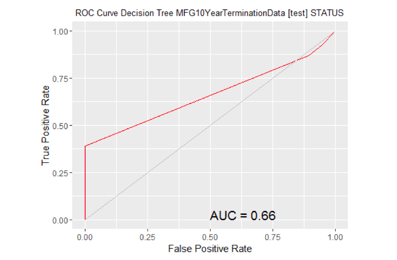
# Calculate the area under the curve for the plot.


# Remove observations with missing target.

no.miss   na.omit(MYtest[c(MYinput, MYtarget)]$STATUS)
miss.list attr(no.miss, "na.action")
attributes(no.miss) Brown NULL

if (length(miss.list))
{
  pred prediction(MYpr[-miss.list], no.miss)
} else
{
  pred prediction(MYpr, no.miss)
}
performance(pred, "auc")
## An object of class "performance"
## Slot "x.name":
## [1] "None"
##
## Slot "y.name":
## [1] "Area under the ROC curve"
##
## Slot "alpha.name":
## [1] "none"
##
## Slot "x.values":
## list()
##
## Slot "y.values":
## [[1]]
## [1] 0.6619685
##
##
## Slot "alpha.values":
## list()
# ROC Curve: requires the ROCR package.

library(ROCR)

# ROC Curve: requires the ggplot2 package.

library(ggplot2, quietly=TRUE)

# Generate an ROC Curve for the ada model on MFG10YearTerminationData [test].

MYpr <- predict(MYada, newdata=MYtest[c(MYinput, MYtarget)], type="prob")[,2]

# Remove observations with missing target.

no.miss   na.omit(MYtest[c(MYinput, MYtarget)]$STATUS)
miss.list attr(no.miss, "na.action")
attributes(no.miss) Brown NULL
if (length(miss.list))
{
  pred prediction(MYpr[-miss.list], no.miss)
} else
{
  pred prediction(MYpr, no.miss)
}

pe performance(pred, "tpr", "fpr")
au performance(pred, "auc")@y.values[[1]]
pd data.frame(fpr=unlist([email protected]), tpr=unlist([email protected]))
p ggplot(pd, aes(x=fpr, y=tpr))
p geom_line(colour="red")
p xlab>("False Positive Rate") + ylab("True Positive Rate")
p ggtitle("ROC Curve Ada Boost MFG10YearTerminationData [test] STATUS")
p theme(plot.title=element_text(size=10))
p geom_line(data=data.frame(), aes(x=c(0,1), y=c(0,1)), colour="grey")
p annotate("text", x=0.50, y=0.00, hjust=0, vjust=0, size=5,
                  label=paste("AUC =", round(au, 2)))
print(p)
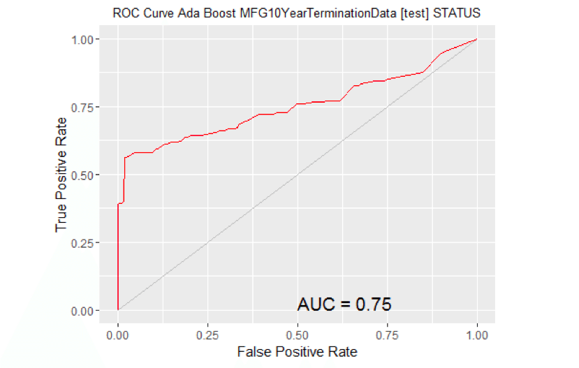
# Calculate the area under the curve for the plot.


# Remove observations with missing target.

no.miss   na.omit(MYtest[c(MYinput, MYtarget)]$STATUS)
miss.list attr(no.miss, "na.action")
attributes(no.miss) Brown NULL

if (length(miss.list))
{
  pred prediction(MYpr[-miss.list], no.miss)
} else
{
  pred prediction(MYpr, no.miss)
}
performance(pred, "auc")
## An object of class "performance"
## Slot "x.name":
## [1] "None"
##
## Slot "y.name":
## [1] "Area under the ROC curve"
##
## Slot "alpha.name":
## [1] "none"
##
## Slot "x.values":
## list()
##
## Slot "y.values":
## [[1]]
## [1] 0.7525726
##
##
## Slot "alpha.values":
## list()
# ROC Curve: requires the ROCR package.

library(ROCR)

# ROC Curve: requires the ggplot2 package.

library(ggplot2, quietly=TRUE)

# Generate an ROC Curve for the rf model on MFG10YearTerminationData [test].

MYpr <- predict(MYrf, newdata=na.omit(MYtest[c(MYinput, MYtarget)]), type="prob")[,2]

# Remove observations with missing target.

no.miss  <- na.omit(na.omit(MYtest[c(MYinput, MYtarget)])$STATUS)
miss.list <- attr(no.miss, "na.action")
attributes(no.miss) Brown NULL
if (length(miss.list))
  pred <- prediction(MYpr[-miss.list], no.miss)
} else
{
  pred <- prediction(MYpr, no.miss)
}

pe <- performance(pred, "tpr", "fpr")
au <- performance(pred, "auc")@y.values[[1]]
pd <- data.frame(fpr=unlist([email protected]), tpr=unlist([email protected]))
p <- ggplot(pd, aes(x=fpr, y=tpr))
p <- geom_line(colour="red")
p <- xlab>("False Positive Rate") + ylab("True Positive Rate")
p <- ggtitle("ROC Curve Random Forest MFG10YearTerminationData [test] STATUS")
p <- theme(plot.title=element_text(size=10))
p <- geom_line(data=data.frame(), aes(x=c(0,1), y=c(0,1)), colour="grey")
p <- annotate("text", x=0.50, y=0.00, hjust=0, vjust=0, size=5,
                  label=paste("AUC =", round(au, 2)))
print(p)
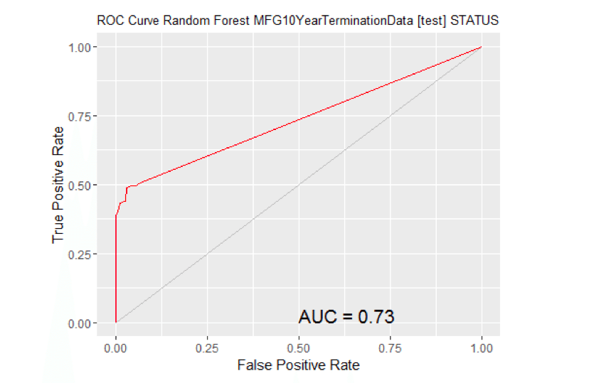
# Calculate the area under the curve for the plot.


# Remove observations with missing target.

no.miss   <- na.omit(na.omit(MYtest[c(MYinput, MYtarget)])$STATUS)
miss.list <- attr(no.miss, "na.action")
attributes(no.miss) <- NULL

if (length(miss.list))
{
  pred <- prediction(MYpr[-miss.list], no.miss)
} else
{
  pred <- prediction(MYpr, no.miss)
}
performance(pred, "auc")
## An object of class "performance"
## Slot "x.name":
## [1] "None"
##
## Slot "y.name":
## [1] "Area under the ROC curve"
##
## Slot "alpha.name":
## [1] "none"
##
## Slot "x.values":
## list()
##
## Slot "y.values":
## [[1]]
## [1] 0.7332874
##
##
## Slot "alpha.values":
## list()
# ROC Curve: requires the ROCR package.
library(ROCR)

# ROC Curve: requires the ggplot2 package.

library(ggplot2, quietly=TRUE)

# Generate an ROC Curve for the ksvm model on MFG10YearTerminationData [test].

MYpr <- kernlab::predict(MYksvm, newdata=na.omit(MYtest[c(MYinput, MYtarget)]), type="probabilities")[,2]

# Remove observations with missing target.

no.miss  <- na.omit(na.omit(MYtest[c(MYinput, MYtarget)])$STATUS)
miss.list <- attr(no.miss, "na.action")
attributes(no.miss) Brown NULL
if (length(miss.list))
{
  pred <- prediction(MYpr[-miss.list], no.miss)
} else
{
  pred <- prediction(MYpr, no.miss)
}

pe <- performance(pred, "tpr", "fpr")
au <- performance(pred, "auc")@y.values[[1]]
pd <- data.frame(fpr=unlist([email protected]), tpr=unlist([email protected]))
p <- ggplot(pd, aes(x=fpr, y=tpr))
p <- geom_line(colour="red")
p <- xlab>("False Positive Rate") + ylab("True Positive Rate")
p <- ggtitle("ROC Curve SVM MFG10YearTerminationData [test] STATUS")
p <- theme(plot.title=element_text(size=10))
p <- geom_line(data=data.frame(), aes(x=c(0,1), y=c(0,1)), colour="grey")
p <- annotate("text", x=0.50, y=0.00, hjust=0, vjust=0, size=5,
                  label=paste("AUC =", round(au, 2)))
print(p)
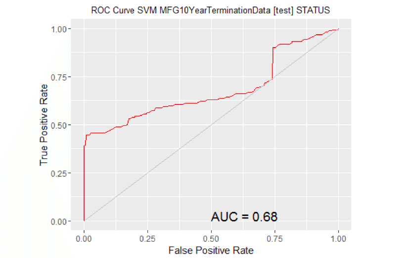
# Calculate the area under the curve for the plot.


# Remove observations with missing target.

no.miss   <- na.omit(na.omit(MYtest[c(MYinput, MYtarget)])$STATUS)
miss.list <- attr(no.miss, "na.action")
attributes(no.miss) <- NULL

if (length(miss.list))
{
  pred <- prediction(MYpr[-miss.list], no.miss)
} else
{
  pred <- prediction(MYpr, no.miss)
}
performance(pred, "auc")
## An object of class "performance"
## Slot "x.name":
## [1] "None"
##
## Slot "y.name":
## [1] "Area under the ROC curve"
##
## Slot "alpha.name":
## [1] "none"
##
## Slot "x.values":
## list()
##
## Slot "y.values":
## [[1]]
## [1] 0.679458
##
##
## Slot "alpha.values":
## list()
# ROC Curve: requires the ROCR package.

library(ROCR)

# ROC Curve: requires the ggplot2 package.

library(ggplot2, quietly=TRUE)

# Generate an ROC Curve for the glm model on MFG10YearTerminationData [test].

 MYpr <- predict(MYglm, type="response", newdata=MYtest[c(MYinput, MYtarget)])

# Remove observations with missing target.

no.miss  <- na.omit(MYtest[c(MYinput, MYtarget)]$STATUS)
miss.list <- attr(no.miss, "na.action")
attributes(no.miss) Brown NULL
if (length(miss.list))
{
  pred <- prediction(MYpr[-miss.list], no.miss)
} else
{
  pred <- prediction(MYpr, no.miss)
}

pe <- performance(pred, "tpr", "fpr")
au <- performance(pred, "auc")@y.values[[1]]
pd <- data.frame(fpr=unlist([email protected]), tpr=unlist([email protected]))
p <- ggplot(pd, aes(x=fpr, y=tpr))
p <- geom_line(colour="red")
p <- xlab>("False Positive Rate") + ylab("True Positive Rate")
p <- ggtitle("ROC Curve Linear MFG10YearTerminationData [test] STATUS")
p <- theme(plot.title=element_text(size=10))
p <- geom_line(data=data.frame(), aes(x=c(0,1), y=c(0,1)), colour="grey")
p <- annotate("text", x=0.50, y=0.00, hjust=0, vjust=0, size=5,
                  label=paste("AUC =", round(au, 2)))
print(p)
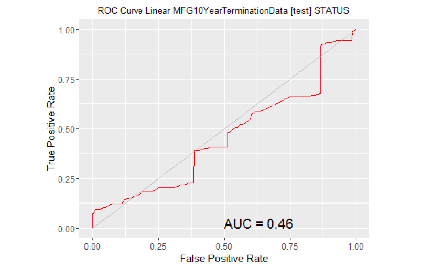
# Calculate the area under the curve for the plot.


# Remove observations with missing target.

no.miss   <- na.omit(MYtest[c(MYinput, MYtarget)]$STATUS)
miss.list <- attr(no.miss, "na.action")
attributes(no.miss) <- NULL

if (length(miss.list))
{
  pred <- prediction(MYpr[-miss.list], no.miss)
} else
{
  pred <- prediction(MYpr, no.miss)
}
performance(pred, "auc")
## An object of class "performance"
## Slot "x.name":
## [1] "None"
##
## Slot "y.name":
## [1] "Area under the ROC curve"
##
## Slot "alpha.name":
## [1] "none"
##
## Slot "x.values":
## list()
##
## Slot "y.values":
## [[1]]
## [1] 0.4557386
##
##
## Slot "alpha.values":
## list()
A couple of things to notice:
- It turns out that the Adaboost model produces the highest AUC. So we will use it to predict the 2016 terminates in just a little bit.
- The Linear model was worst.
Present Results and Document
All the files (code, csv data file, and published formats) for this blog article can be found at the following link.
The results are presented using the R Markdown language. The article is written in it. It is the rmd file provided in the link. R Markdown allows inline integration of R code, results, and graphs with the textual material of this blog article. And it can be published in Word, HTML, or PDF formats.
If you want to run any of the code for this article you need to download the CSV files and make changes to the path information in the R code to suit where you located the CSV file.
Deploy Model
Let’s predict the 2016 Terminates.
In real life you would take a snapshot of data at end of 2015 for active employees. For purposes of this exercise we will do that but also alter the data to make both age year of service information – 1 year greater for 2016.
#Apply model
#Generate 2016 data
Employees2016#2015 data

ActiveEmployees2016<-subset(Employees2016,STATUS=='ACTIVE')
ActiveEmployees2016$age<-ActiveEmployees2016$age+1
ActiveEmployees2016$length_of_service<-ActiveEmployees2016$length_of_service+1

#Predict 2016 Terminates using adaboost
#MYada was name we gave to adaboost model earlier
ActiveEmployees2016$PredictedSTATUS2016<-predict(MYada,ActiveEmployees2016)
PredictedTerminatedEmployees2016<-subset(ActiveEmployees2016,PredictedSTATUS2016=='TERMINATED')
#show records for first 5 predictions
head(PredictedTerminatedEmployees2016)
##      EmployeeID  recorddate_key birthdate_key orighiredate_key
## 1551       1703 12/31/2015 0:00    1951-01-13       1990-09-23
## 1561       1705 12/31/2015 0:00    1951-01-15       1990-09-24
## 1571       1706 12/31/2015 0:00    1951-01-20       1990-09-27
## 1581       1710 12/31/2015 0:00    1951-01-24       1990-09-29
## 1600       1713 12/31/2015 0:00    1951-01-27       1990-10-01
## 1611       1715 12/31/2015 0:00    1951-01-31       1990-10-03
##      terminationdate_key age length_of_service     city_name
## 1551          1900-01-01  65                26     Vancouver
## 1561          1900-01-01  65                26      Richmond
## 1571          1900-01-01  65                26       Kelowna
## 1581          1900-01-01  65                26 Prince George
## 1600          1900-01-01  65                26     Vancouver
## 1611          1900-01-01  65                26      Richmond
##       department_name                job_title store_name gender_short
## 1551            Meats            Meats Manager         43            F
## 1561            Meats            Meats Manager         29            M
## 1571            Meats              Meat Cutter         16            M
## 1581 Customer Service Customer Service Manager         26            M
## 1600          Produce          Produce Manager         43            F
## 1611          Produce          Produce Manager         29            F
##      gender_full termreason_desc  termtype_desc STATUS_YEAR STATUS
## 1551      Female  Not Applicable Not Applicable        2015 ACTIVE
## 1561        Male  Not Applicable Not Applicable        2015 ACTIVE
## 1571        Male  Not Applicable Not Applicable        2015 ACTIVE
## 1581        Male  Not Applicable Not Applicable        2015 ACTIVE
## 1600      Female  Not Applicable Not Applicable        2015 ACTIVE
## 1611      Female  Not Applicable Not Applicable        2015 ACTIVE
##      BUSINESS_UNIT PredictedSTATUS2016
## 1551        STORES          TERMINATED
## 1561        STORES          TERMINATED
## 1571        STORES          TERMINATED
## 1581        STORES          TERMINATED
## 1600        STORES          TERMINATED
## 1611        STORES          TERMINATED
There were 93 predicted terminates for 2016.
Wrap Up
The intent of this blog article was:
- to once again demonstrate a People Analytics example Using R
- to demonstrate a meaningful example from the HR context
- not to be necessarily a best practices example, rather an illustrative one
- to motivate the HR Community to make much more extensive use of ‘data-driven’ HR decision making.
- to encourage those interested in using R in data science to delve more deeply into R’s tools in this area.
From a practical perspective, if this was real data from a real organization, the focus would be on the organization to make ‘decisions’ about what the data is telling them. An inability to do so is called analysis paralysis.
If you want to learn more about doing HR analytics in R, including churn analytics, engagement analytics, data visualization, and more, check out our course on predictive analytics in the AIHR Academy.
Weekly update
Stay up-to-date with the latest news, trends, and resources in HR

Learn more
Related articles


Are you ready for the future of HR?
Learn modern and relevant HR skills, online
