A Tutorial on People Analytics Using R – Clustering

We recently published an article titled “A Beginner’s Guide to Machine Learning for HR Practitioners” where we touched on the three broad types of Machine Learning (ML); reinforcement, supervised, and unsupervised learning. In this follow-up article, we will explore unsupervised ML in more depth. We will demonstrate, how we use cluster analysis, a subset of unsupervised ML, to identify similarities, patterns, and relationships in datasets intelligently (like humans – but faster or more accurately) – and we have included some practical code examples written in R. Let’s get started!
Cluster Analysis in HR
The objective we aim to achieve is an understanding of factors associated with employee turnover within our data. To do this, we form clusters based on a set of employee variables (i.e., Features) such as age, marital status, role level, and so on. The clusters help us better understand the many attributes that may be associated with turnover, and whether there are distinct clusters of employees that are more susceptible to turnover. This last insight can facilitate the personalizing of the employee experience at scale by determining whether current HR policies are serving the employee clusters identified in the analysis, as opposed to using a one size fits all approach.
1. Importing the Data
We begin by importing the R libraries we will need for the analysis. The dataset we have used for our example is publicly available – it’s the IBM Attrition dataset. You can download it here if you would like to follow along.
suppressPackageStartupMessages({
    library(tidyverse) # data workhorse
    library(readxl) # importing xlsx files
    library(correlationfunnel) # rapid exploratory data analysis
    library(cluster) # calculating gower distance and PAM
    library(Rtsne) # dimensionality reduction and visualization
    library(plotly) # interactive graphing
})

set.seed(175) # reproducibility

hr_data_tbl <- read_xlsx("~/Desktop/R/Clustering/Data/datasets_1067_1925_WA_Fn-UseC_-HR-Employee-Attrition.xlsx")
2. Selecting Variables for Clustering
Under normal circumstances, we would spend time exploring the data – examining variables and their data types, visualizing descriptive analyses (e.g., single variable and two variable analyses), understanding distributions, performing transformations if needed, and treating missing values and outliers.
However, for the sake of simplicity, we will skip this and instead just calculate the correlation between attrition and each variable in the dataset. Those variables with a correlation of greater than 0.1 will be included in the analysis. This is useful for several reasons, but most importantly to decide which variables to include for our cluster analysis.
Keep in mind that when it comes to clustering, including more variables does not always mean a better outcome. Including more variables can complicate the interpretation of results and consequently make it difficult for the end-users to act upon results.
# examine the strength of relationship between attrition and the other variables in the data set

hr_corr_tbl <- hr_data_tbl %>%
    select(-EmployeeNumber) %>%
    binarize(n_bins = 5, thresh_infreq = 0.01, name_infreq = "OTHER", one_hot = TRUE) %>%
    correlate(Attrition__Yes)

hr_corr_tbl %>%
    plot_correlation_funnel() %>%
    ggplotly()
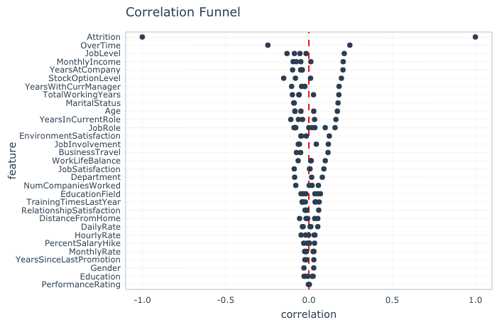
By using our correlation value of 0.1 as a cutoff, the analysis suggests the inclusion of 14 variables for clustering: from overtime to business travel. In preparation for the analysis, any of these fourteen variables which are of a character data type (e.g. MaritalStatus = Single) are converted to a factor datatype (more on this below).
# select the variables we wish to analyze
var_selection <- c("EmployeeNumber", "Attrition", "OverTime", "JobLevel", "MonthlyIncome", "YearsAtCompany", "StockOptionLevel", "YearsWithCurrManager", "TotalWorkingYears", "MaritalStatus", "Age", "YearsInCurrentRole", "JobRole", "EnvironmentSatisfaction", "JobInvolvement", "BusinessTravel")

# several variables are character and need to be converted to factors
hr_subset_tbl <- hr_data_tbl %>%
  select(one_of(var_selection)) %>%
  mutate_if(is.character, as_factor) %>%
  select(EmployeeNumber, Attrition, everything())
3. Analysis: Gower Distance
In essence, clustering is all about determining how similar (or dissimilar) cases in a dataset are to one another so that we can then group them together. To do this we first need to give each case (i.e., employee) a score based on the fourteen variables selected and then determine the difference between employees based on this score.
The most common way of performing this activity is by calculating the “Euclidean Distance”. However, Euclidean Distance only works when analyzing continuous variables (e.g., age, salary, tenure), and thus is not suitable for our HR dataset, which includes ordinal (e.g., EnvironmentSatisfaction – values from 1 = worst to 5 = best) and nominal data types (MaritalStatus – 1 = Single, 2 = Divorced, etc.). Therefore, we have to use a distance metric that can handle different data types; the Gower Distance.
The main advantage of Gower Distance is that it is simple to calculate and intuitive to understand. However, the disadvantage of this method is that it requires a distance matrix, a data structure that compares each case to every other case in the dataset, which needs considerable computing power and memory for large datasets.
# Compute Gower distance and covert to a matrix
gower_dist <- daisy(hr_subset_tbl[, 2:16], metric = "gower")
gower_mat <- as.matrix(gower_dist)
We can perform a sanity check on our distance matrix by determining the most similar and/or dissimilar pair of employees. Here we calculate the two most similar employees according to their Gower Distance score.
# Print most similar employees
hr_subset_tbl[which(gower_mat == min(gower_mat[gower_mat != min(gower_mat)]), arr.ind = TRUE)[1, ], ]
## # A tibble: 2 x 16
## EmployeeNumber Attrition OverTime JobLevel MonthlyIncome YearsAtCompany
## <dbl> <fct> <fct> <dbl> <dbl> <dbl>
## 1 1624 Yes Yes 1 1569 0
## 2 614 Yes Yes 1 1878 0
## # … with 10 more variables: StockOptionLevel <dbl>, YearsWithCurrManager <dbl>,
## # TotalWorkingYears <dbl>, MaritalStatus <fct>, Age <dbl>,
## # YearsInCurrentRole <dbl>, JobRole <fct>, EnvironmentSatisfaction <dbl>,
## # JobInvolvement <dbl>, BusinessTravel <fct>
We learn from our sanity check that EmployeeID 1624 and EmployeeID 614, let’s call them Bob and Fred, are considered to be similar because they show the same value for each of the fifteen variables, with the exception of monthly salary. Both have left the company, used to work overtime in a junior position and were on a similar salary. The Gower Metric seems to be working and the output makes sense, now let’s perform the cluster analysis to see if we can understand turnover.
4. Analysis: How many Clusters?
The one big question that must be answered when performing cluster analysis is “how many clusters should we segment the dataset into?”
We can use a data-driven approach to determine the optimal number of clusters by calculating the silhouette width. With this metric, we measure how similar each observation (i.e., in our case one employee) is to its assigned cluster, and conversely how dissimilar it is to neighboring clusters. The metric can range from -1 to 1, where values of 1 show a clear cluster assignment, 0 suggests weak cluster assignment (i.e., a case could have been assigned to one of two neighboring clusters) and -1 wrong cluster assignment.
#determine the optimal number of clusters for the data
sil_width <- map_dbl(2:10, function(k){
  model <- pam(gower_dist, k = k)
  model$silinfo$avg.width
})

sil_tbl <- tibble(
  k = 2:10,
  sil_width = sil_width
)
# print(sil_tbl)

fig2 <- ggplot(sil_tbl, aes(x = k, y = sil_width)) +
  geom_point(size = 2) +
  geom_line() +
  scale_x_continuous(breaks = 2:10)
ggplotly(fig2)
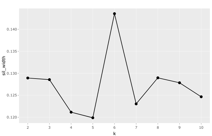
To identify the number of clusters with the highest silhouette width, we perform the cluster analysis with differing numbers of clusters. In our case we choose two through to ten clusters. The reason we limited the maximum number of clusters to ten is that the larger numbers become the more difficult it becomes to interpret and ultimately act upon. As can be seen from the graph, six clusters generated the highest average silhouette width and will, therefore, be used in our analysis.
It is important to note that the average silhouette value (0.14) is actually quite low. According to anecdotal evidence, we would ideally want, at a minimum, a value between 0.25 and 0.5 (see Kaufmann and Rousseuw, 1990). Our low value might be indicative of limited structure in the data, or weaker performing clusters than others (i.e., some clusters group loosely, while others group tightly). To find out more about the reason behind the low value we have opted to look at the practical insights generated by the clusters and to visualize the cluster structure using t-Distributed Stochastic Neighbor Embedding (t-SNE). Both of these are explained below.
5. Analysis: Interpreting the Clusters
A topic we have not addressed yet, despite having already performed the clustering, is the method of cluster analysis employed.
In this analysis, we used the Partitioning Around Medoids (PAM) method. This method is identical to K-Means which is the most common form of clustering practiced. The only difference is that cluster centers for PAM are defined by the raw dataset observations, which in our example are our 14 variables. This PAM approach has two key benefits over K-Means clustering. Firstly, it is less sensitive to outliers (e.g., such as a very high monthly income). Secondly, PAM also provides an exemplar case for each cluster, called a “Medoid”, which makes cluster interpretation easier.
With that this in mind, let’s re-run the cluster analysis with 6 clusters, as informed by our average silhouette width, join the cluster analysis results with our original dataset to identify into which cluster each individual falls in, and then take a closer look at the six Medoids representing our six clusters.
k <- 6

pam_fit <- pam(gower_dist, diss = TRUE, k)

hr_subset_tbl <- hr_subset_tbl %>%
  mutate(cluster = pam_fit$clustering)

#have a look at the centroids to understand the clusters
hr_subset_tbl[pam_fit$medoids, ]
## # A tibble: 6 x 17
##   EmployeeNumber Attrition OverTime JobLevel MonthlyIncome YearsAtCompany
##            <dbl> <fct>     <fct>       <dbl>         <dbl>          <dbl>
## 1           1171 No        No              2          5155              6
## 2             35 No        No              2          6825              9
## 3             65 Yes       Yes             1          3441              2
## 4            221 No        No              1          2713              5
## 5            747 No        No              2          5304              8
## 6           1408 No        No              4         16799             20
## # … with 11 more variables: StockOptionLevel <dbl>, YearsWithCurrManager <dbl>,
## #   TotalWorkingYears <dbl>, MaritalStatus <fct>, Age <dbl>,
## #   YearsInCurrentRole <dbl>, JobRole <fct>, EnvironmentSatisfaction <dbl>,
## #   JobInvolvement <dbl>, BusinessTravel <fct>, cluster <int>
To better understand attrition in our population we calculated the rate of attrition in each cluster, and how much each cluster captures overall attrition in our dataset.
attrition_rate_tbl <- hr_subset_tbl %>%
    select(cluster, Attrition) %>%
    mutate(attrition_num = (as.numeric(Attrition) *-1) +2) %>%
    group_by(cluster) %>%
    summarise(
Cluster_Turnover_Rate = (sum(attrition_num) / length(attrition_num)) %>% scales::percent(accuracy = 0.1),
Turnover_Count = sum(attrition_num),
Cluster_Size = length(attrition_num)
) %>%
ungroup() %>%
mutate(Population_Turnover_Rate = (Turnover_Count / sum(Turnover_Count)) %>% scales::percent(accuracy = 0.1))
## `summarise()` ungrouping output (override with `.groups` argument)
attrition_rate_tbl
## # A tibble: 6 x 5
##   cluster Cluster_Turnover_Ra… Turnover_Count Cluster_Size Population_Turnover_…
##     <int> <chr>                         <dbl>        <int> <chr>
## 1       1 8.6%                             23          268 9.7%
## 2       2 8.6%                             24          280 10.1%
## 3       3 79.7%                           141          177 59.5%
## 4       4 8.0%                             29          364 12.2%
## 5       5 4.0%                              8          202 3.4%
## 6       6 6.7%                             12          179 5.1%
It is now evident that almost 80% of employees in Cluster 3 left the organization, which represents approximately 60% of all turnover recorded in the entire dataset. Great! Our identified clusters appear to generate some groupings clearly associated with turnover. Based on this we can gather a descriptive understanding of the combination of variables associated with turnover.
Unfortunately, our code-based output up to this point is more attuned to data analysts than business partners and HR stakeholders. To make the results more digestible and actionable for non-analysts we will visualize them.
One way to collectively visualize the many variables from our cluster analysis together is with a method called t-SNE. This method is a dimensionality reduction technique that seeks to preserve the structure of the data while reducing it to two or three dimensions—something we can visualize! Technically, this step is not necessary but is recommended as it can be helpful in facilitating the understanding of results and thereby increasing the likelihood of action taken by stakeholders. In addition, it enables us to check the cluster structure, which was identified as weak by our average silhouette width metric.
We first create labels for our visualization, perform the t-SNE calculations, and then visualize the t-SNE outputs.
data_formatted_tbl <- hr_subset_tbl %>%
    left_join(attrition_rate_tbl) %>%
    rename(Cluster = cluster) %>%
    mutate(MonthlyIncome = MonthlyIncome %>% scales::dollar()) %>%
    mutate(description = str_glue("Turnover = {Attrition}

                                  MaritalDesc = {MaritalStatus}
                                  Age = {Age}
                                  Job Role = {JobRole}
                                  Job Level {JobLevel}
                                  Overtime = {OverTime}
                                  Current Role Tenure = {YearsInCurrentRole}
                                  Professional Tenure = {TotalWorkingYears}
                                  Monthly Income = {MonthlyIncome}

                                  Cluster: {Cluster}
                                  Cluster Size: {Cluster_Size}
                                  Cluster Turnover Rate: {Cluster_Turnover_Rate}
                                  Cluster Turnover Count: {Turnover_Count}

                                  "))
## Joining, by = "cluster"
# map the clusters in 2 dimensional space using t-SNE
tsne_obj <- Rtsne(gower_dist, is_distance = TRUE)

tsne_tbl <- tsne_obj$Y %>%
  as_tibble() %>%
  setNames(c("X", "Y")) %>%
  bind_cols(data_formatted_tbl) %>%
  mutate(Cluster = Cluster %>% as_factor())

g <- tsne_tbl %>%
    ggplot(aes(x = X, y = Y, colour = Cluster)) +
    geom_point(aes(text = description))
## Warning: Ignoring unknown aesthetics: text
ggplotly(g)
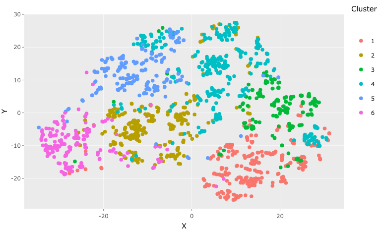
The plot allows us to graph our cluster analysis results in two dimensions, enabling end-users to visualize something that was previously code and concepts.
As suggested earlier by the average silhouette width metric (0.14), the grouping of the clusters is “serviceable”. There are some cases in each cluster that appear distant to the other cases in the cluster, but generally, the clusters appear to somewhat group together (Cluster 4 appears the weakest performer). On a practical note, it was reassuring that 80% of cases captured by Cluster 3 related to employee turnover, thereby enabling us to achieve our objective of better understanding attrition in this population.
When viewing the graphs in html format (go here to view them in html) we can hover over any dot in our visualization and find out about its cluster membership, cluster turnover metrics, and the variable values associated with the employee. When we hover over cases in Cluster 3, we see variables associated with employees that are similar to our Cluster 3 Medoid, younger, scientific & sales professionals, with a few years of professional experience, minimal tenure in the company, and that left the company. We are beginning to develop a “persona” associated with turnover, meaning that turnover is no longer a conceptual problem, it’s now a person we can characterize and understand.
Ideally, this knowledge enables us to develop tailored interventions and strategies that improve the employee experience within the organization and reduce the risk of unwanted turnover. The biggest benefit we gain from performing a cluster analysis as we just did is that intervention strategies are then applicable to a sizable group; the entire cluster, thus making it more cost-effective and impactful.
In addition, the analysis also shows us areas of the employee population where turnover is not a problem. This information may also be valuable when reviewing our employee offerings (e.g., policies and practices) and how well these offerings address turnover among our six clusters/personas. Furthermore, it can also influence the way in which we invest in future employee experience initiatives and our employee strategy in general.
On a final note
In this instance, we have demonstrated the process for performing cluster analysis (Unsupervised ML) using a mixture of data types to understand the topic of turnover in an HR dataset. Cluster analysis, while not a panacea for every HR problem, is a powerful method for understanding topics and people in HR, which can inform the way in which HR practitioners pragmatically scale personalized employee experiences and move away from the one size fits all approach.
Weekly update
Stay up-to-date with the latest news, trends, and resources in HR
Learn more
Related articles
Are you ready for the future of HR?
Learn modern and relevant HR skills, online


